Blog

Office Wayfinding: A Guide to Floor Plan Signage, Maps, and Who Does What

Content Marketing Specialist
­­­­­–

Last updated on Sep 14, 2026

The short version

  • Wayfinding is the experience of navigating a building. Signage is just one part of the mix, along with maps and digital tools.
  • Offices struggle with this more than other buildings because layouts keep changing and hybrid employees never really get a feel for the place.
  • Static signs go out of date when something moves, but an interactive map built on your floor plan updates itself the moment you change the plan.
  • Get your room and desk names consistent first, and make sure reception's using the same ones.
  • Nobody does all of it alone. Sign companies do physical signs, design firms do the branded strategy, and the digital layer, maps, kiosks, on-plan signage, comes from a workplace platform. elia's one of those.

You know how there's always at least one sign in an office that's just wrong?

‍

Like when someone renamed the conference room and didn’t swap the little plate on the door, so people are still walking into the wrong room (happened to me…). Offices change all the time, so that's completely normal. In fact, the average one moves 1-3% of its desks a month, and some move a lot more, going by Matterport's numbers.

‍

Wayfinding helps you find your way around the office without stale signs or asking a million people. When it works, you don't even think about it.

‍

Here's a plain guide to setting it up:

‍

  • what wayfinding is, and how it differs from signage
  • why offices are so bad at it
  • digital vs static signage
  • how to build a system on your floor plan
  • five types of wayfinding signage
  • and more :)

What is wayfinding?

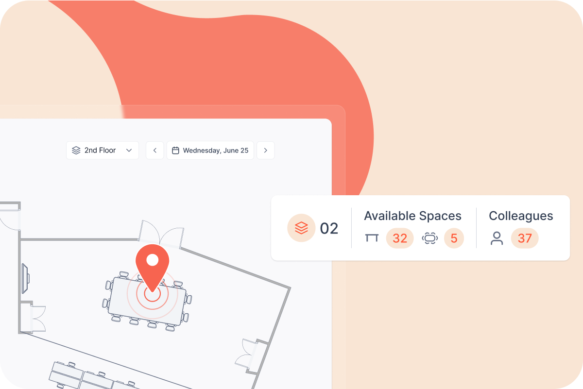
What is wayfinding?
Source: elia

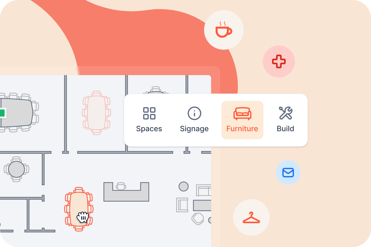
Wayfinding is what gets you from the front door to the right room without stopping to ask. It includes signs, but also a map by the elevator, colours on the floor, a landmark giant plant everyone uses, and an app that shows your desk for the day.

‍

A proper system has a few different pieces working together:

‍

  • Directional signage, the arrows.
  • Identification and informational signs that name things and give a bit of context.
  • Colour and icons to help you tell different floors or areas apart quickly.
  • Maps and directories, on the wall and screens.
  • The digital layer and kiosks that keep everything up tp date.

Signage and wayfinding aren’t the same thing. Signage is the signs. Wayfinding is whether people can find their way, which leans just as much on the layout and the names. You can buy amazing signs and still watch people wander if the floor plan is outdated.

‍

Offices are a worse case than most buildings for this, and poor wayfinding has real costs, wasted time, frustrated new hires, and a bad first impression on visitors. Commercial buildings and hospitals can keep the same layout for years. Your office, though, won't sit still for a quarter, and a good chunk of people are only there two or three days a week, so they never really learn the place.

Why offices are so bad at wayfinding

With dedicated desks, this wasn’t a big deal since you learned where everything was and stopped noticing the signs. But then hybrid workplaces became the norm, and that was the end of that. You can see the damage in a few specific spots:

‍

  • There's no muscle memory anymore. Come in two days a week, sit somewhere different each time, and you never get that sense of the place that you'd get with a fixed desk.
  • New starters and visitors notice it first. The visitor experience forms while they're stuck at reception, working out which way to go.
  • It becomes someone's job. Facilities and IT answer the same questions over and over, especially when people can't find where they're supposed to be.
  • Paper can't keep up. The building is getting rearranged every week, and by the time you print out the signs and put them up, they're already a bit old.
  • People give up on bookings. Can't find the room you reserved, and sometimes you just skip the meeting or grab whatever's free, and now the booking data doesn't mean much either.

One of the facilities leads we talked to has two buildings connected together on the inside, but they're on different streets. He calls the whole thing a real-life mazw. He's come up with a temporary solution: printing out the floor plans and just handing them out to people when they arrive because paper's still the fastest way to get someone to the right place.

‍

Every time the team gets reshuffled, he has to put in a request to his vendor and wait a week or two for the update. So the floor plan is always a step behind the building.

‍

Most of the advice you get on signage comes from sign companies that assume you'll never have to change anything. The office usually does, every month, and once signage goes up, staying in step with that isn't anyone's job.

Digital wayfinding vs static wayfinding signs

Static signs aren't the enemy, so don't rip them off the walls. Most offices keep both and use each for what it's good at:

‍

Dimension Static signs Digital wayfinding
When something moves around Out of date till someone redoes it Same day, no problem
Updating Reprint and rehang each sign Change once, it updates everywhere
Cost over time You pay again on every change Usually part of a platform you pay for
Finding things You walk and read Search a name, a desk, a room, or an amenity
Live info Fixed Shows what's free right now, if it's wired to booking
Power and network Needs neither Needs a screen or a mobile device
Accessibility Tactile and braille at the door Filter for step-free routes, high-contrast view

‍

It's not just renaming either. Teams grow and need more desks. A meeting room gets split into two phone booths. On paper, that means reprinting a sign and getting someone to hang it, and that never happens the same day.

‍

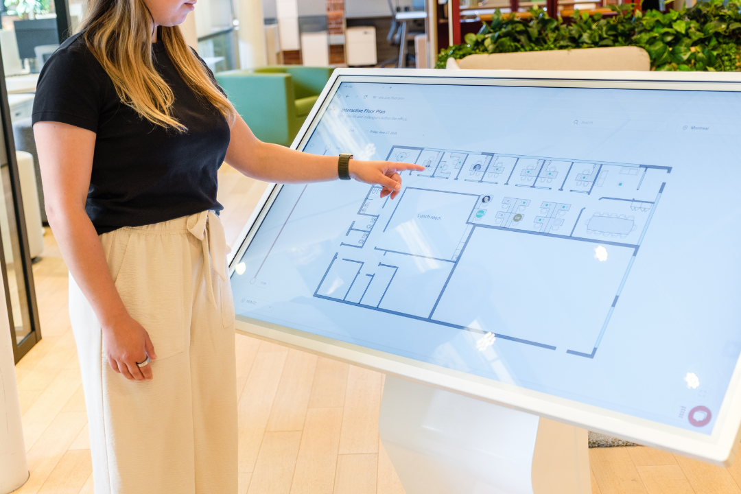
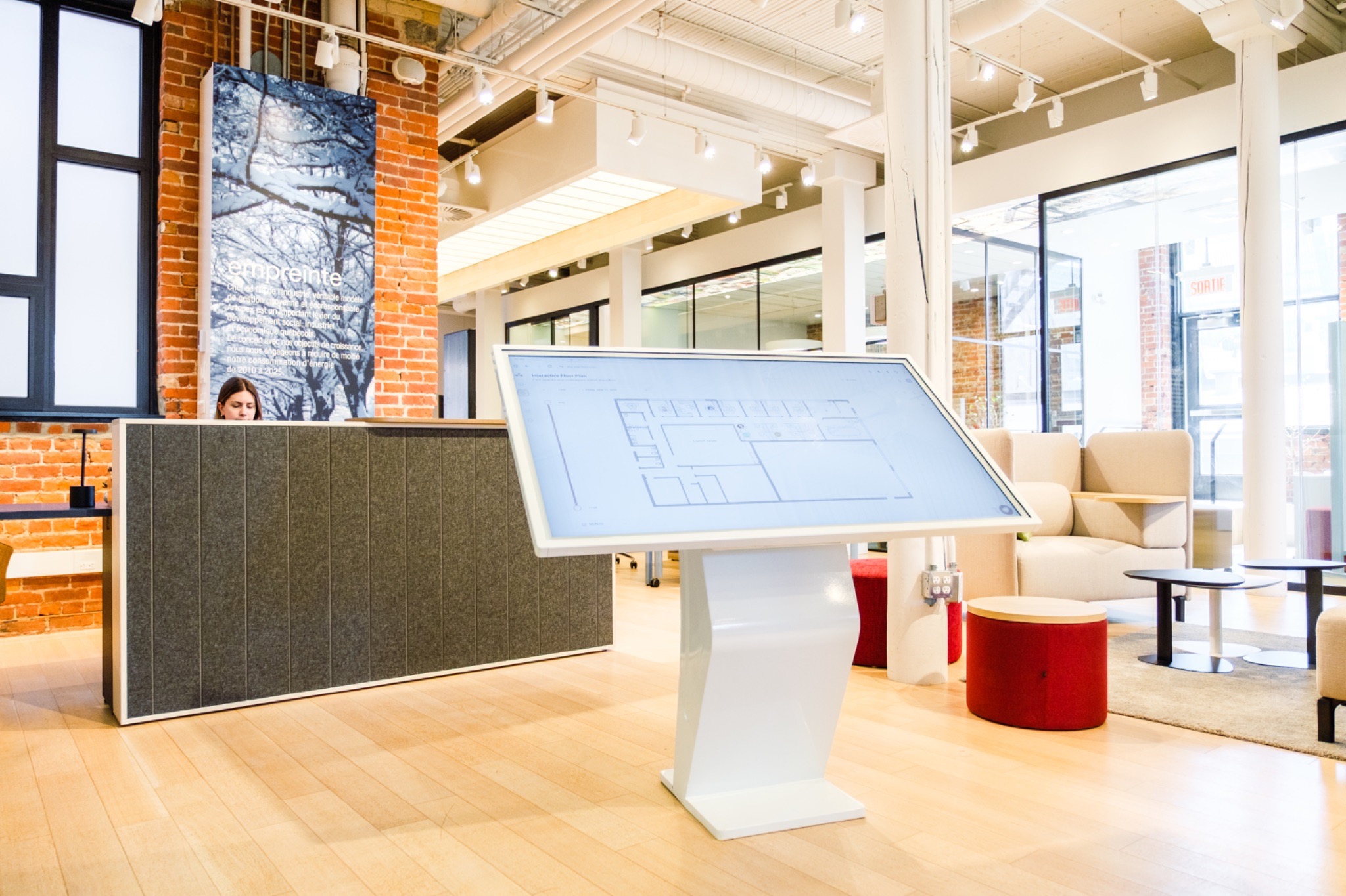
A digital map only has that lag if nobody's updating it. You change the plan, and it's right on the screen wherever people are looking, no reprinting or waiting on a vendor. For example, at elia, we put the same map on our own touchscreen wayfinding kiosk too, so the one in the lobby and the one in someone's pocket show the same thing.

elia navigation kiosk

How much wayfinding tech do you need?

If you have just one building and one entrance, a few decent signs and a map people can bring up on their phone are probably enough. You don’t need to build a whole wayfinding system around it.

‍

A few more floors or two buildings connected like that maze example, and an interactive kiosk by the elevators becomes quite handy. Someone can walk up and get pointed in the right direction without having to dig out their phone.

‍

And if you have lots of visitors coming through, I’d put more effort into the mobile side. They’re not going to know where your kiosk is, so they’re going to take out their phone and search. If the map doesn’t work properly there, you’ll still have people at reception asking where to go.

‍

For big places (hospitals, airports, connected towers, large commercial campuses), you can take it much further, including using turn-by-turn indoor navigation or even augmented reality. But that’s a pretty small group of offices, and most don’t need anything close to that.

Who provides office wayfinding signage and software

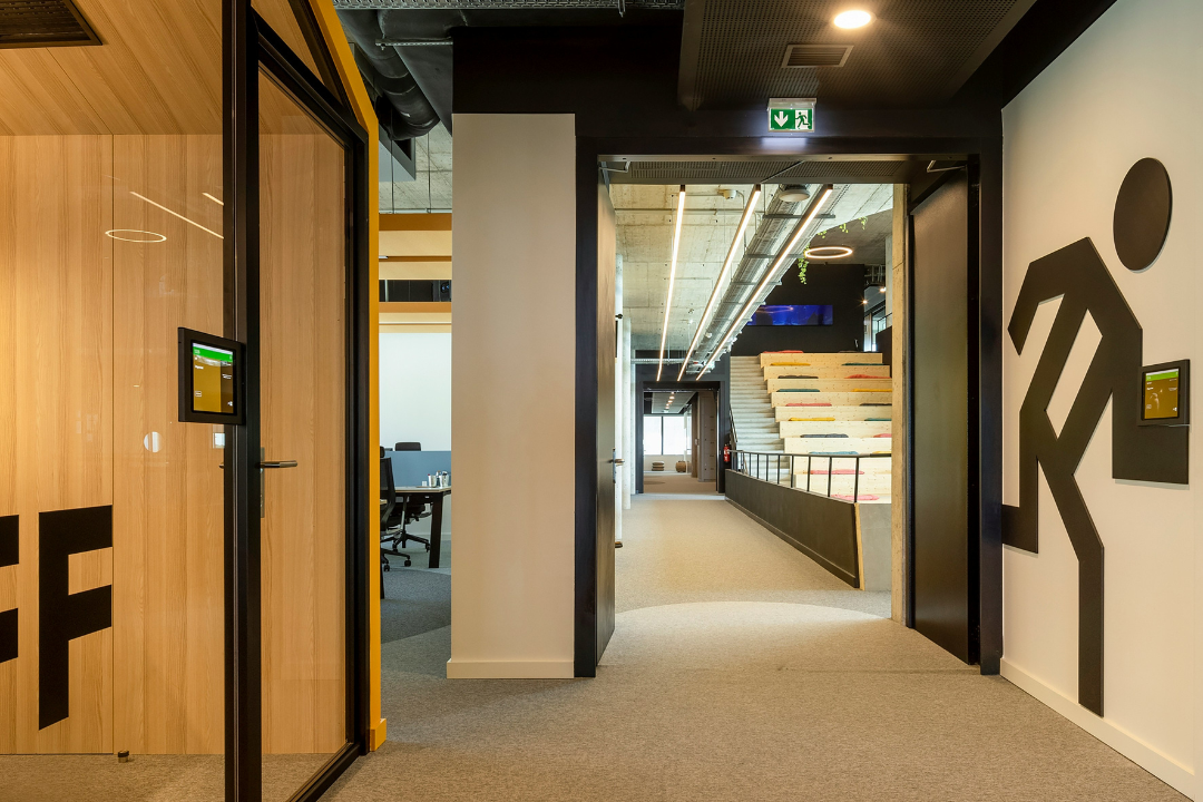
elia way finding
Source: elia

Most of the time this splits across a few different companies, so here's where each piece comes from:

‍

  • For physical signs (door plates, arrows, room numbers, the tactile ones by the entrance), you’ll probably be looking at a local sign company or print shop. They’re the ones to make the signs, and if your office barely changes over time, that might be all you need.
  • Design and strategy (signage design for a full branded system in big or complex spaces) is a job for an environmental graphic design firm.
  • The digital layer (a live floor plan, on-plan signage that updates itself, wayfinding kiosks linked to desk booking and room booking) comes from a wayfinding software company, or more often a whole workplace platform, the category elia's in.

The good news is these three work together nicely. A sign company will hang the permanent signs, while a workplace platform offers the wayfinding solutions that keep the map underneath it fresh.

5 types of wayfinding signage

There are 5 kinds of sign you’ll see everywhere, and each one has its place on the plan that mirrors where you'd find it on a wall.

‍

Type What it does On the floor plan
Identification signs Names a particular spot Labels on every bookable desk and room
Directional signs Points people in the right direction Arrows from the elevator round to the right wing
Informational signs Gives context & background info A directory of who sits where or what's on each floor
Regulatory signs Sets the rules "Staff only," "Keep this fire door shut"
Orientation signs "You are here" A lobby kiosk, basically a big interactive one

‍

Each covers a different question a person gets when they're lost, so if you cover all five, no one should be stuck. When the standard set misses something odd about your building, then it's time to think up a custom type.

How to build an office wayfinding system

Before you start messing with the layout, take a walk through the building as if you're a visitor. Even better, see how someone else does it. Where do they hesitate? At the entrance or that fork in the corridor where three paths meet? Those are the areas you'll need to put some extra work later on, way more than you would for a room tucked away inside a floor.

‍

This is really about watching how people navigate to a specific destination: a desk, a printer, a first aid kit… You get the idea.

‍

After that, it's a simple 5-step process:

‍

  1. Give everything a name. If the room is called “Cedar” on the door and “Cedar 3.14” on the calendar, you might as well think of them as two separate rooms for all your systems care. Pick one name per building, floor, desk and room, and make sure people at reception are on the same page too.
    ‍
  2. Tag each space with what people look for. Seats, a screen, natural light, step-free access. Next time someone is searching for a room with 6 seats and a screen, they'll find the right one.
    ‍
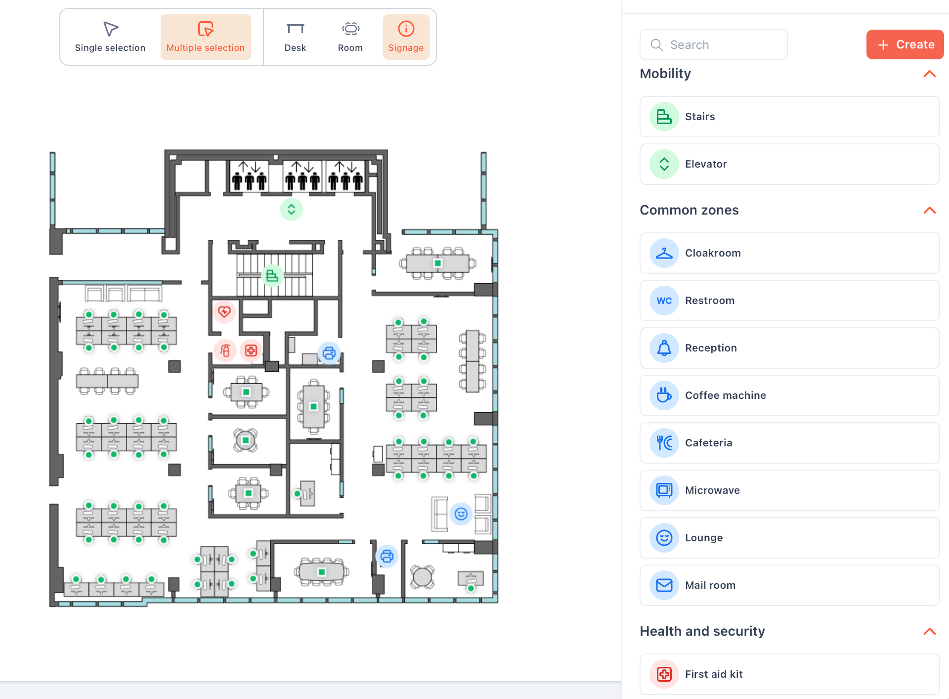
  3. Put your signage on the floor plan. Most tools you're using will have an edit button right there on the plan. So use it! Drop on ready-made sign types instead of plain text, and add a quick description that shows up when someone taps it.
signage in elia
Source: elia
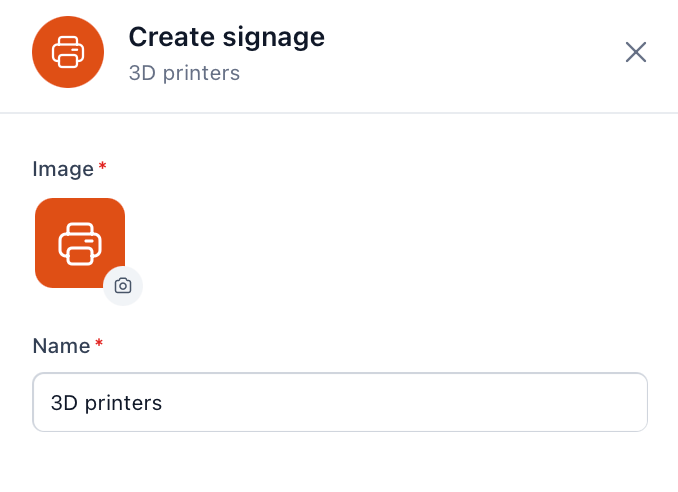
  1. Create your custom sign types when you need them. You can give them any name, colour, icon, and file them under their special category so the plan doesn't become a mess. Say, your office has a whole wellness floor or a maker space full of 3D printers. Nothing in the standard list covers that, so you just make one that does.
custom signage in elia
Source: elia
  1. Get it out there. Change one thing, and it's live for everyone to see.

How to make office wayfinding accessible

Wayfinding has to work for people who don't read a building the way you do. Accessible signage is easy to put off till the last minute and then forget, which is a shame.

‍

On the physical side, it's mostly about the signs themselves:

‍

  • Mount tactile characters, lettering and braille where a hand can reach them, not up where only your eyes can find them. Most guidance puts it around waist to shoulder height.
  • Use good colour contrast, so a sign reads well from a distance and works for low-vision readers.
  • Don't rely on colours to tell two things apart, that's a recipe for disaster. Colour blindness is common, so make sure you're pairing the colours with shapes or labels.
  • Add standard symbols to help anyone who doesn't read the local language.
  • Put multiple language options on key signs if you have international teams or regular visitors from abroad.

On the digital side, a map can do things paper never could, though none of it happens automatically, you have to set it up that way:

‍

  • Tag your step-free routes and accessible bathrooms so people can filter those.
  • Keep your digital displays nice and contrasty, just like you would with a printed sign, so the map is easy to read. Don't forget those kiosks and info screens either.
  • Ensure your system plays nice with screen readers and doesn't leave out people who rely on that tech to navigate the world.

Emergency and safety wayfinding

Everything so far is for a normal day. The same floor plan can have your safety info too, and in elia, for example, that has its own health and safety view.

‍

You mark your exits, first aid kits, defibrillators, fire extinguishers and assembly points on the plan. Then, when you need the safety view, you can switch to it and the safety markers become the focus while the desk bookings fade back, so nobody's squinting past booking icons trying to find a fire exit.

‍

That filtering helps outside emergencies as well. One facilities lead we spoke with prints a version of the plan with nothing on it but the extinguishers when an inspector's coming through, so they walk straight to each one instead of wandering around looking.

‍

And if you want the markers, including exit signs, to mean the same thing for everyone, there's a standard for it called ISO 7010:

‍

Colour Shape Used for
Green Square Safe conditions: exit signs, first aid, assembly points
Red Square Fire equipment: extinguishers, hose reels, alarm points
Yellow Triangle Hazard warnings
Blue Circle Required actions

‍

The safety info needs updating too. A safety map that’s been on the wall since two renovations ago can actually be worse than no map at all. People still trust it, even though the building has changed.

‍

Most tools let you drop safety icons on a map, but pay attention to what’s coming next:

‍

  • Have enough trained first-aiders in the building on a given day. With hybrid schedules, it's getting harder to get everyone in the same room at the same time. Get them on the plan at least, so you can see where they all are.
  • Get to the right people fast when something goes wrong. A shared map gives everyone the same picture, but the map alone won't do it.

How to roll out office wayfinding

No big plan needed for this one:

‍

  1. Take one site and get its floor plan in, following the steps above.
    ‍
  2. Put your everyday signs at decision points, the spots where someone picks a direction, like entrances and elevator lobbies, since that's usually where a first-timer either finds the room or starts wandering.
    ‍
  3. Set up the safety layer and check it against the real signs, so they agree.
    ‍
  4. Then keep it current. Layout changes, you update the plan. Done.

A few simple questions tell you if it's working and give you accurate information to make informed decisions about what to fix next: Can a first-time visitor find a booked room without asking reception? Can someone who needs a step-free route find one? Does the room name match on the door and on the map? How often is the map wrong after a change goes through?
‍

If this sounds like your office, let's grab some time and look at your floor plan together instead of talking about it in the abstract.

is a Content Marketing Specialist at elia. With 10+ years in content marketing, she writes about workplace trends and the tools that help teams work smarter. Part strategist, part storyteller, Tamara brings equal amounts of data, creativity, and a little Moon Prism Power to every piece she creates. 🌙✨
Contents
    Subscribe to our newsletter
    Subscribe to the elia newsletter for exclusive product updates and industry best practices. You can unsubscribe at any time.
    Thank you! You're subscribed.
    Oops! Something went wrong while submitting the form.

    Frequently Asked Questions

    Answers to Your Common Queries

    Do you need an indoor positioning system for office wayfinding?
    How much does office wayfinding cost?
    How often should you update office wayfinding?
    Who owns office wayfinding, facilities, HR, or IT?
    How do visitors and new hires find their way without downloading an app?